Swedish mag Vi Bilägare ran a test. Same setup as four years ago, but the results? Worse.
Drivers on a closed airfield, cruising at 110 km/h (68 mph). The task: do normal stuff while driving. Turn on the heater. Switch the radio. Dim the lights. Simple. Four years ago they covered about 756 meters while fiddling. Now it’s 813 meters. Two extra seconds with your eyes off the road.
Does that sound like much?
Maybe. Maybe not.
How They Measured Distraction
Two drivers. Ten cars. Weather: 12 degrees C, partly cloudy. Lunda Airport.
The rules were strict. Both hands on the wheel before starting. No voice commands—too inconsistent across brands. If you drift or stall, you do it again.
They also looked at gloved hand operation, screen glare, and how far you have to look down. Phone integration counted too.
“Design matters more than physical switches.”
That’s the takeaway. The headlines screamed that Mazda lost to Tesla, but it’s simpler than that.
Buttons vs. Glass
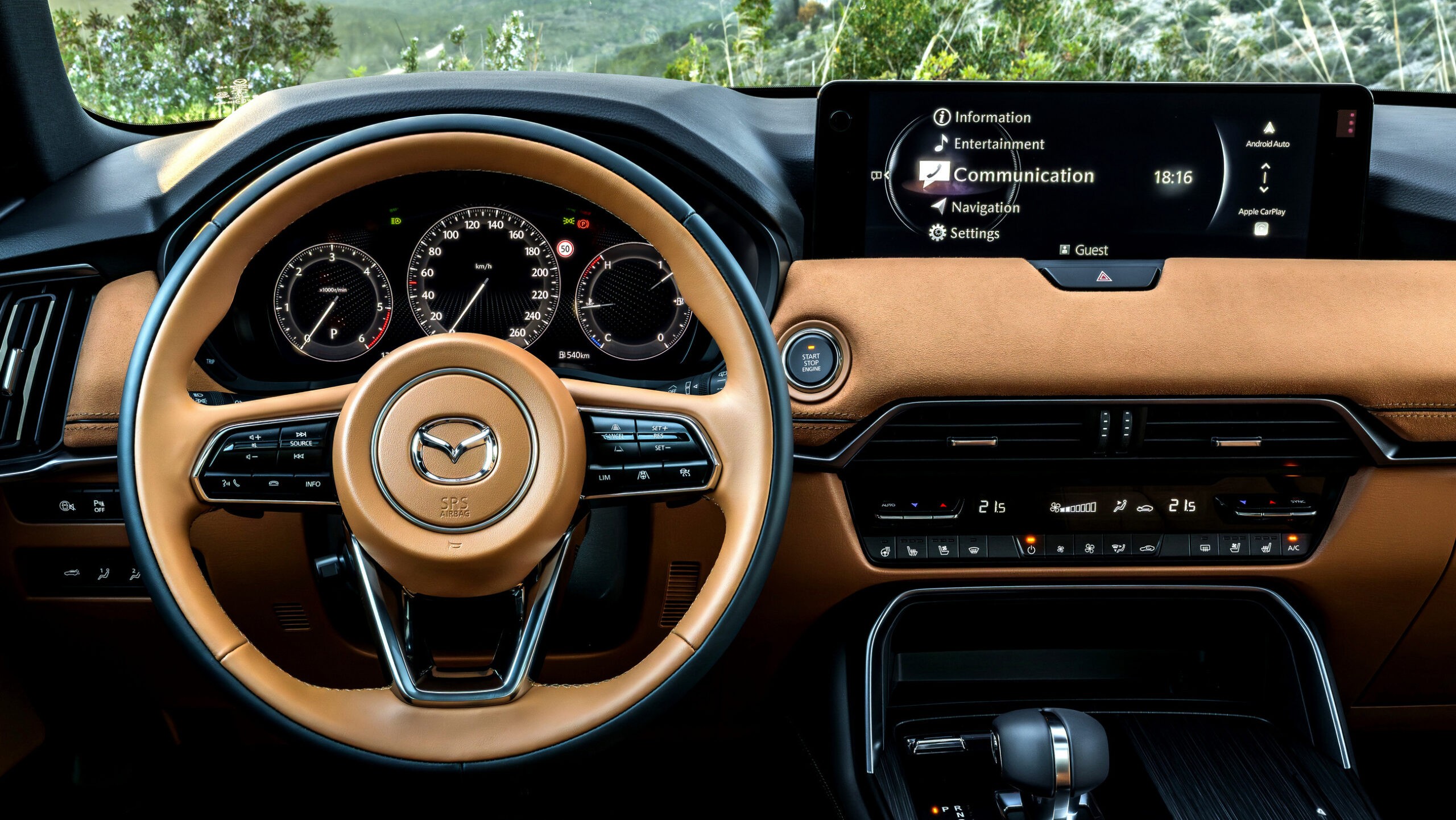
The Mazda CX-60 looks like a cockpit. Fifty buttons. Physical. Tactile. You’d think it’s safe.
It finished last among the heavy hitters.
Why? The touchscreen locks while moving. You can’t change things via glass, but the physical buttons for certain functions? Hard to find or unintuitive. The result: 1,137 meters. Thirty-seven seconds. The cabin was loud with options but poor on logic.
Tesla is different. The Model Y has four buttons. Just four. Gear selector. Mirror controls. Rest is screen.
And yet, it improved.
Volvo XC60 crushed the field. 485 meters. The screen works because the UI makes sense. You don’t dig for menus.
Old button-heavy cars? Not inherently safer. A 2016 Volvo with knobs took nearly 2.5 times longer than the modern XC60. It’s about layout.
Where Your Eyes Go
This part is scary.
How far down do you look?
Volvo XC60 demands a 35-degree glance.
Nissan Qashqai? 12.3-inch screen now, but still bad geometry.
MG Marvel R? 56 degrees. You are practically looking at your lap.
Toyota Corolla Cross had a decent screen, but hide one setting in three menu layers. Drivers rolled nearly 600 meters just to dim the cluster lighting.
Mercedes got worse. 15 seconds slower. Their CLA screen takes 19 seconds to wake up after you unlock the door. Nineteen.
Tesla wakes instantly. Door opens, screen alive. Skoda nailed it with 18 seconds total, using a mix of knobs and touch.
So, Is The Data Real?
Ten cars. That’s the sample.
Ten out of thousands.
Does that represent the whole industry? Hardly.
Familiarity matters. Steering wheel controls matter. Even the temperature outside can shift grip on the glass.
But the trend is clear. Bigger screens don’t equal distraction. Bad interfaces do.
Mazda thought more buttons meant clarity. It didn’t. Tesla stripped it back to glass. It worked, provided the code is good.
We traded knobs for menus and lost time doing it. Or we kept buttons but buried them under bad UX.
So when your next car comes with a touchscreen the size of a window… are you prepared?
Or will you be hunting for the defroster at 100 km/h?